Elise: making a jewellery site feel safe to buy from
I audited four leading jewellery sites, found where my own screens fell short, and redesigned the product page, size guide, bag and checkout on desktop and mobile.
4
brands audited across 10 dimensions
3
recurring gaps found
10
reusable components built
5
content contradictions fixed
The problem
People can’t touch jewellery, so they buy on photos, measurements and reassurance. My screens looked polished, but I had no evidence they gave enough of that.
What I did
Audited
Scored Mejuri, Brilliant Earth, Cartier and Tiffany with a written rubric. I marked anything I couldn’t verify as unknown, not zero.
Prioritised
Turned the gaps into six ranked recommendations, each a testable hypothesis.
Designed and systemised
Rebuilt the screens in Figma with variables and components.
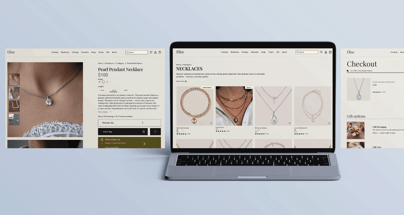

Three decisions that mattered
1
Visible zoom
Competitors hid it, so I added a labelled button on the hero image.
2
Trust at the buy button
Rating, 30-day returns, 2-year warranty and free resizing sit right under Add to Bag.
3
Clear size and scale
A size guide with necklace, ring and bracelet tabs, replacing a single line of text.
Attention to detail
Reading every screen against the others, I found the same product at $79 and $100, returns shown as 30 and 90 days, and three different free-delivery thresholds. I flagged each and fixed it once confirmed.
Want the full story?
See the full audit, every design decision and the complete before-and-after set in the full case study.