Case study · Product design · Desktop and mobile
Elise: designing for confidence when you can’t touch the product
I audited four leading jewellery sites, found where my own high-fidelity screens fell short, and redesigned the product, bag, checkout and size guide with a small design system behind it.
Role
UX and UI designer (self-directed project)
Scope
Competitive audit, UX redesign, design system, desktop and mobile
Tools
Figma, variables and components, audit rubric
Dimension
Mejuri
Brilliant Earth
Cartier
Tiffany*
Macro zoom
2
2
3
NV
Gallery structure
2
3
2
NV
On-model photos
2
3
2
NV
Physical scale
1
3
2
1
Material specs
3
4
3
3
Trust signals
3
3
2
2
Fit and sizing
3
3
3
3
Media completeness
2
3
2
NV
Delivery and returns
3
3
3
2
Purchase controls
3
3
2
2
Scores run 0 to 4. NV means not verified, never treated as zero. *Tiffany was assessed from page text only because the visual pages were blocked.
The problem
Shoppers can’t hold a ring or check the clasp on a necklace. They decide from photos, measurements and reassurance. My Elise screens looked polished, but I had no evidence they gave people enough to buy with confidence.
So I asked a narrow question: what do category leaders do to reduce doubt on a product page, and where are my screens behind?
My process
01
Audit
I inspected one ring and one necklace page on Mejuri, Brilliant Earth, Cartier and Tiffany across 10 dimensions, scored against a written rubric.
02
Find the gaps
Three patterns repeated: weak scale guidance, shallow zoom with no visible controls, and trust signals sitting far from the buy button.
03
Prioritise
I ranked six recommendations by likely impact and effort, and wrote each as a testable hypothesis, not a promise.
04
Design
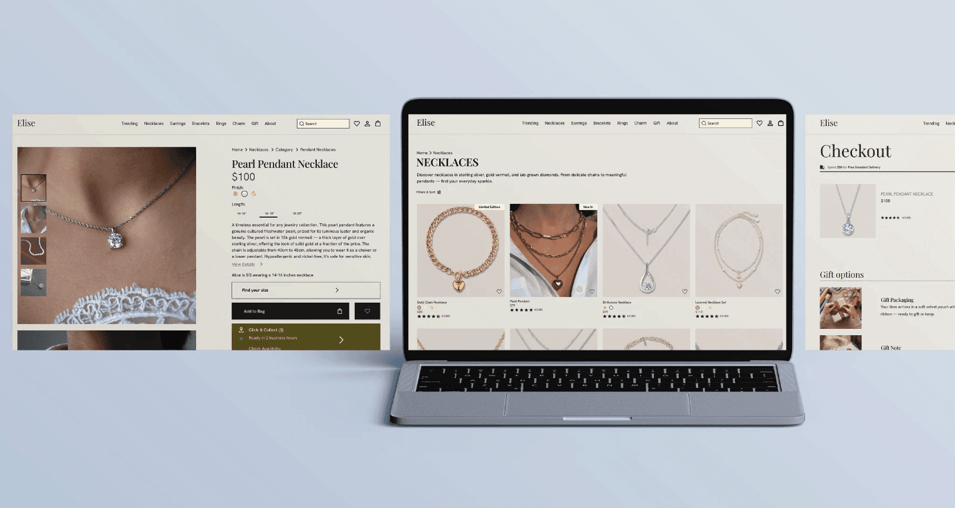
I rebuilt the product page, size guide, bag and checkout in Figma on desktop and mobile.
05
Systemise
I turned repeated pieces into variables and components so the changes stay consistent.
06
Check consistency
I read every screen against the others and fixed contradictions in the content.

What I found
No page I checked showed a usable 4 to 5x zoom. Only Brilliant Earth paired on-model photos with measurement-labelled imagery. Mejuri and Brilliant Earth put reassurance near the buy controls, while Cartier left it in body copy and showed no reviews.
Limits I stated up front: desktop only, one ring and one necklace per brand, and Tiffany from text. Findings describe those pages, not each site as a whole.

Design decisions
Each decision follows the same chain: evidence, decision, reason.
1
Make zoom visible
Evidence
Zoom controls were hidden or missing on the pages I tested.
Decision
A labelled Zoom button on the hero image, thumbnails moved off the photo, and an image counter.
Why
A feature people can’t find gives them nothing. Labelled controls are the cheapest fix.
2
Put trust at the buy button
Evidence
The best-scoring pages placed returns, warranty and ratings next to the add-to-cart action.
Decision
Rating under the price. A trust row under Add to Bag: 30-day returns, 2-year warranty, free resizing.
Why
Reassurance works best at the moment of decision.
3
Show the specs and the scale
Evidence
Specs sat behind a collapsed link and scale relied on one line of text.
Decision
A product details table beside the buy controls. A size guide with tabs for necklace, ring and bracelet, a photo strip, a highlighted length table and a button that returns to the page.
Why
Size misjudgement is a main reason people send jewellery back.
4
Say delivery and returns once, clearly
Evidence
Competitor pages gave conflicting return messages, and my own checkout used vague wording.
Decision
One estimated delivery row, a clear free-delivery message tied to the $99 threshold, and help links in the mobile footer.
Why
An unanswerable question is friction, whichever policy is real.
5
Make mobile a first-class screen
Evidence
My mobile product page had text cut off at the right edge and no reviews.
Decision
Fixed the text width, added reviews, a bottom-sheet size guide, category tabs on the catalog and a help list in the footer.
Why
Most browsing happens on a phone, and the phone page should carry the same confidence.
A small design system
New elements used hard-coded values, so I turned them into tokens and components. Changing a component updates every screen that uses it.
11
colour variables
5
spacing steps
2
radii
2
text styles
Zoom Button
Image Counter
Trust Item
Spec Row
Delivery Row
Rating Summary
Size Tab
Photo Tile
Footer Help Row
Trust Ticker

Catching contradictions
Reading every screen against the others turned up content that disagreed. I raised each one and fixed it once the owner confirmed the right answer.
Found
Resolved as
Pearl Pendant listed at $79 in the catalog and $100 elsewhere
$100 everywhere
Returns shown as 90 days on mobile and 30 days on desktop
30 days
Free delivery shown as over $79, $99 and $150
Over $99; checkout and bag messages rewritten
Installment price didn’t match the order total
Recalculated from the total
The same product repeated twice in the mobile catalog
Replaced with the missing Gold Chain Necklace
This is the work I enjoy most: noticing the small mismatch that makes a customer stop trusting the page.
How I’d measure it
I haven’t tested this with users yet, so I make no claims about results. Every recommendation is a hypothesis with a way to check it.
Conversion:
add-to-cart and purchase rate on the product page, against a baseline over the same season.
Returns:
return reasons grouped as size, scale, not as pictured and material, once return windows have passed.
Engagement:
zoom, size guide and photo views as early signals.
Usability test:
five moderated sessions where people choose a length and find the returns policy. I’d watch for hesitation, not just success.
User Flow

What I’d do next, and what I learned
Test
the zoom and size guide with real shoppers, then A/B the trust row.
Check feasibility
with engineers: the image sizes zoom needs, loading performance, and how the ticker animates.
Run accessibility checks
on contrast, tap targets and keyboard order. I already raised several low-contrast texts.
Replace my placeholders
such as pearl size and photos, with real product data.
The biggest lesson was to separate evidence from opinion. Writing down what I couldn’t verify made the work easier to trust, and showed me where to look next.
