Losoul
Client:
Keapsake
Service:
Branding
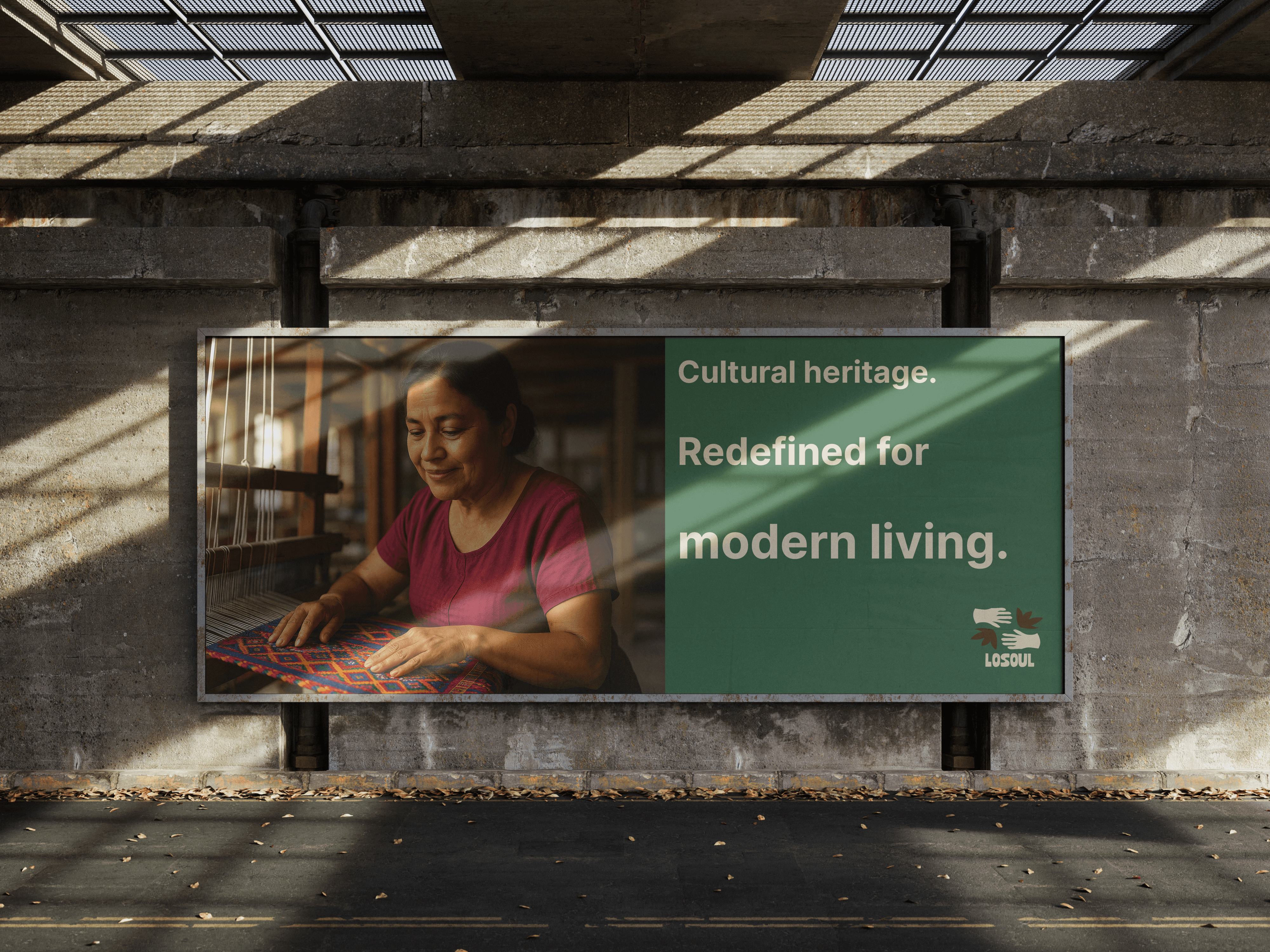
Losoul is the rebranding of Keapsake, designed to reposition the brand as a leader in sustainable craftsmanship, cultural heritage, and conscious luxury. The brand identity centers on the beauty of handmade goods, celebrating the stories, skill, and empowerment of women artisans while providing a meaningful alternative to mass-produced fast furniture.
Losoul caters to an intentional audience that views true luxury not as wasteful consumerism, but as long-lasting, high-quality homewares and accessories built with passion and heritage. The visual system pairs deep forest greens with warm, earthy cream tones, featuring bold, modern editorial typography, raw hand-drawn badges, and tactile, light-dappled photography.
Communicating with an authentic, grounded, and sophisticated voice, Losoul anchors its strategy with messaging like "Luxury beyond mass production" and "Woven with purpose. Built to last."


Design that speaks before words do.
Typography is the foundation of visual communication. Every typeface choice, every size, every weight shapes how a message is received — from the first headline to the finest caption.
Hanken Grostesk
Aa
this is inter
ABCDEFGHIJKLMNOPQRSTUVWXYZ
abcdefghijklmnopqrstuvwxyz
1234567890

