Available for work
is playing tennis
currently making art latte
is designing
cafe hopping right now
doing 5K run

← All works
Case study · Product design · Desktop & mobile
ELISE JEWELLERY
Details
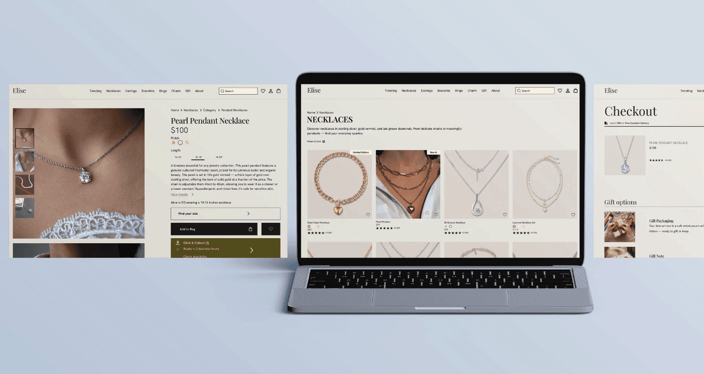
Shoppers can’t hold a ring or check a clasp. I audited four leading jewellery sites, found where my own screens fell short, and redesigned the product page, bag, checkout and size guide with a small design system behind it.
Role
UX & UI designer (self-directed)
Timeline
1 Month
Scope
Audit, UX redesign, design system
Tools
Figma, variables & components

Challenge
Designing for confidence when you can’t touch the product
My Elise screens looked polished, but I had no evidence they gave people enough to buy with confidence. Shoppers decide from photos, measurements and reassurance.
So I asked a narrow question: what do category leaders do to reduce doubt on a product page, and where are my screens behind?
Research
A scored audit of four category leaders
4 brands audited · 10 dimensions scored · 0–4 written rubric
No page showed a usable 4–5× zoom. Only one paired on-model photos with measurement-labelled images. The best pages put returns, warranty and ratings next to the buy button.

Competitive audit · Mejuri, Brilliant Earth, Cartier, Tiffany
My process

01
Audit
One ring and one necklace page per brand, scored across 10 dimensions.

02
Find the gaps
Weak scale guidance, hidden zoom, and trust signals far from the buy button.

03
Design
Rebuilt the product page, size guide, bag and checkout on desktop and mobile.

04
Systemise
Turned repeated pieces into 11 colour variables and 10 components.
Solution
1 · Make zoom visible
Evidence: Zoom controls were hidden or missing on every page tested.
Decision: A labelled Zoom button on the hero image and an image counter.
Why: A feature people can’t find gives them nothing.
2 · Put trust at the buy button
Evidence: The best-scoring pages placed returns and ratings next to Add to Bag.
Decision: Rating under the price; a trust row under the button.
Why: Reassurance works best at the moment of decision.
3 · Show the specs and the scale
Evidence: Specs sat behind a collapsed link; scale relied on one line of text.
Decision: A details table by the buy controls and a tabbed size guide.
Why: Fewer size mistakes means fewer returns.
Outcome
How I’d measure it
Not yet tested with users, so I make no claims about results. Each recommendation is a hypothesis with a way to check it:
Add-to-cart and purchase rate on the product page, against a seasonal baseline
Return reasons grouped by size, scale and “not as pictured”
Size-guide opens and zoom usage per session


